


Making mood boards like it's my job

In the past when I knitted things for myself, the ‘design’ process was pretty linear:
Find a pattern I like → imagine the color/texture I want → try my best to source yarn in this color/texture → start knitting
If I’m doing the process right, I’ll add a step to create a gauge swatch, testing the yarn and needles together. This informs the needle size required to make a fabric that drapes the way that I want… but sometimes I skip this step (usually to my regret).
It’s been a fun new challenge for me to conceptualize a ‘collection’, something I’ve never done before. The process has been a lot more iterative:
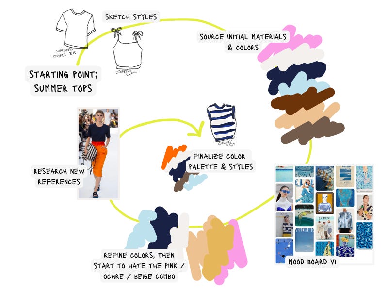
Distilling my mental churn into a coherent format for this newsletter was informative - for me, the following have proven to be the most important factors influencing my collection:
Garment shapes / patterns
I started with a broad theme ‘summer tops’ and sketched some ideas for a few classic, simple shapes
Constraints I took into consideration:
What am I capable of making well with my current machine knitting skill level?
What patterns am I confident I can execute well?
What patterns do I already have in my library?
Materials
I aimed to source summer-appropriate materials, specifically cotton, cotton blends, and synthetics
Sourced exclusively from Goodwill, Fabscrap, and my own bin full of excess yarn
Materials are definitely a constraining factor right now - I only have so much time to hunt down ‘waste’ yarn to match exact color and texture specs, so for now it’s much easier to source the materials first and adjust my initial concepts around the colors and textures that I find. I liken myself to a chef that gets inspired by the fresh ingredients they find at the market. Just in my case the market is Goodwill, not Union Square Greenmarket…
Colors
Getting the ‘color story’ right is extremely important to me. I envision Next Season as a brand known for simple, wearable styles that stand out for their color and texture. I’ve long thought about color combinations and color balance when dressing myself, and I’m finding that this practice can be translated into my design process too.
At one point when looking at the pink/ochre/beige colors the words ‘tequila sunrise’ popped into my head and I knew I had to nix them. Overall the colors were too colorful/bright/saturated and needed to be toned down/mixed with gray aka and made more ‘icky’, for balance. So, I took a beat to look at some reference photos, and searched the old Spring collections of Designers that (I think) do color really well, like Dries Van Noten, Prada, and Miu Miu… This really helped me edit and land on a final palette.
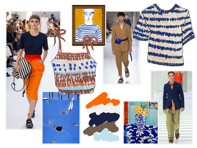
The final mood board that I’m excited to work off of for this collection -
And now I’m on to swatching, making standardized samples of each yarn I plan to use. These swatches are critical for testing and defining multiple variables that inform the technical garment design:
Machine tension and fabric ‘density’ (tightly knit vs loosely knit)
Number of stitches and rows per inch, which in turn informs the number of stitches and rows required to create a garment of a specific size
I don’t have a lot of yarn to spare to make ‘test knits’ or samples of my patterns, so I may need to knit and re-knit things a few times to work through any issues or make tweaks. Looking forward to sharing more about that next week!
-Anne